Its 1972. Smut, murder and death on the streets as well as the killing fields of Vietnam. …..
Art Chantry (art@artchantry.com ) :
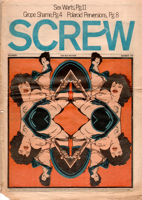
This is the valentine’s day, 1972, issue of the legendary SCREW magazine (cover by “Babe” – a pseudonym?). It was a cheap tabloid newsprint sex mag, the equivalent of a “rolling stone” of sex. This issue hit the boxes (i seem to remember it sold in newsboxes on the street) a few months before I graduated from high school. So, this was the world I entered, smut on the streets, murder and death in Vietnam , drugs and madness on the “home front”. Within a year all my friends became ‘jesus freaks’ and gasoline ran out and we were standing in line for hours to buy 3 dollar gas. Thank god for Screw.

hellman:Al Goldstein was SCREW's publisher. He founded the paper in 1968 with a guy named Jim Buckley, who Goldstein eventually bought out. SCREW was designed to capitalize on growing reader interest in hippie papers like the East Village Other, which occasionally featured photos of nude hippie gals. Milton Glaser designed the classic SCREW logo, (I'm ... See Morenot sure if Glaser's is the version seen here, or the more rounded version that would follow). NYTimes' Steven Heller was an early SCREW art director. Goldstein did a very brief stint, (two or three weeks) in Rikers Island after he lost his 2003 harassment case, but he is not currently in prison. The paper went bankrupt around 2004, leaving Goldstein broke/homeless for a while. I believe he's presently living at a VA hospital here in NYC. If there's a connection between SCREW and EROS' Ginzburg, it would be news to me.
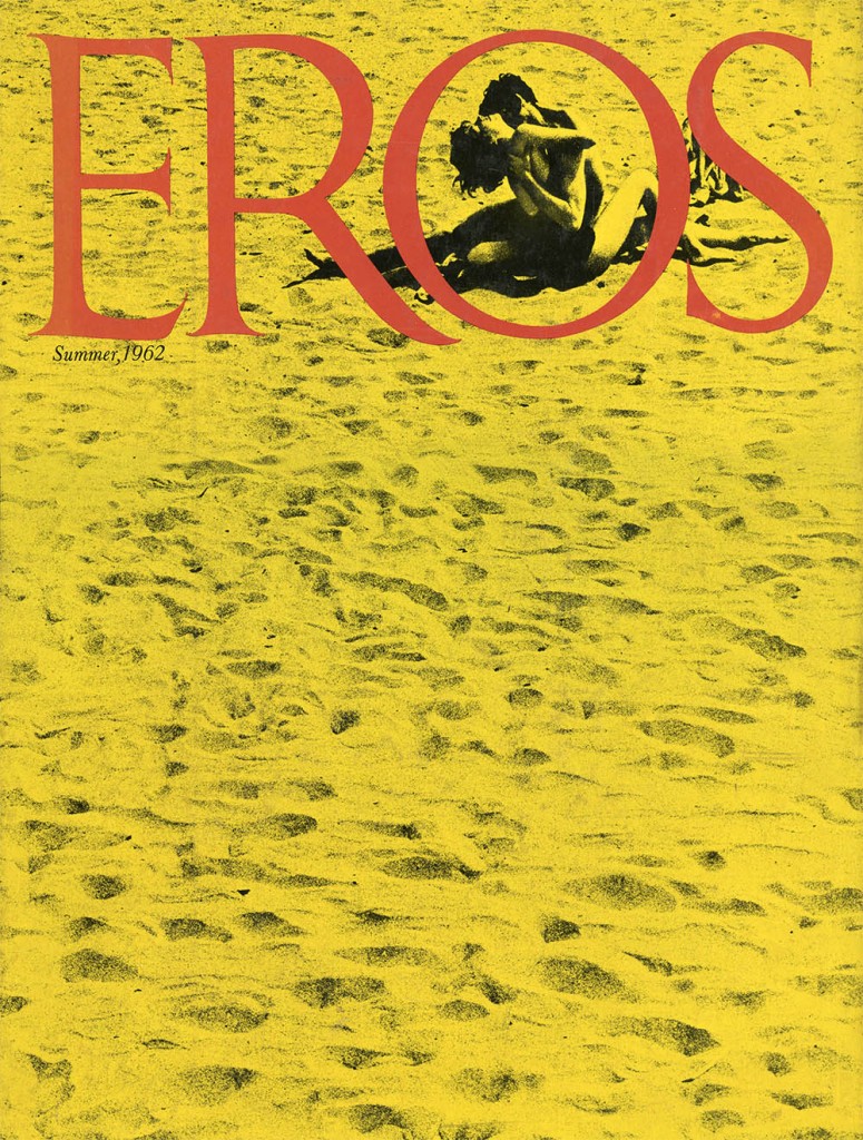
It was edited by the legend, Ralph Ginzburg,( correction Al Goldstein ) the man who also published a short-lived magazine called “eros”. Eros was a hard bound (a hard ‘book like’ cover, a style of magazine for the more sophisticated subscriber that was a brief fad in the 1960’s) and intellectual look at sex, as if psychology today were an erotic journal. It had the very best illustrators and photographers money could buy, and it was also designed by one of the greatest american art directors of all time, Herb Lubalin. It’s still a classic of graphic design history.
Because it was sold ‘subscription only’, it ran afoul of the post office laws and Ginzburg was prosecuted under the law for ‘distributing obscenities through he mail’. the main point of interest in the debate were photos of a white woman and a black man posing in an erotic photo study. Really tame by today’s standards, but a sensation back then.
the resulting battle fought by ginzburg is legendsry, with him eventually losing as a “pornographer” and doing jail time. After he was released he immediately began a publication called “fact:” that documented liberal free speech legal battles and their history (particularly his own). The design (also by lubalin) is yet another classic and beautiful publication for the design history books. ralph ginzburg not only set the model for larry flynt, he also pushed forward the boundaries of magazine design by a quantum leap.

---What can I say about Robert Crumb? He invented underground comix, and after forty years, he remains the towering figure in that scene. His is a household name, spoken reverently by cartoonists and aging hippies, but also familiar to many who've never seen one of his comic books, (thanks largely to filmmaker Terry Zwigoff's 1994 documentary).----click on image for more
Then he started ‘SCREW”. like i said, it was a sort of “rolling stone magazine” for sex. it’s actually a great read and very dirty and also very smart. It’s not classic smut, but actual discussions about sexuality. I guess you could say that it’s not “smut” so much as it’s “about smut.” The publication declined as the 70’s wore on and it basically “became smut.” It was a sad end to a glorious effort.
The main reason i want to show it here is that, once again, Goldstein attempted to use his new york connections in the design world to attempt to push magazine design a few notches. The first thing he did was hire a young hot shot designer as the new art director. his name was “Steven Heller.” yes, THAT Steve Heller, the noted design writer and historian who has published over 100 books on the history of graphic design. (his latest is a monograph about alvin lustig, that blind designer i talked about in an earlier essay in this effort. buy it today. it’s great.)
the first thing steve did was hire his mentor and pal, milton glaser to design the logo/masthead for the magazine. yup, MILTON GLASER designed that logotype there. amazing, huh? he actually turned the middle bar of that cap “E” into a little penis poking into the “W”
onder what “W” stands for???) what dirty old man, eh? uncle milty? who knew!
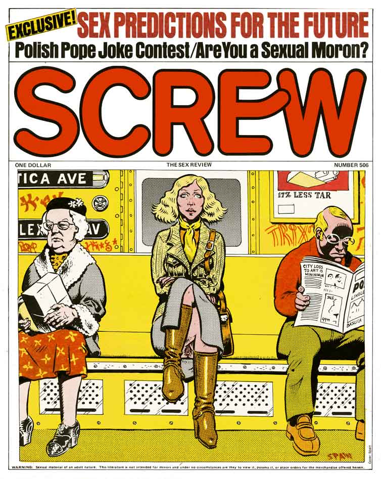
---Besides being one of the founding fathers of Underground Comix, Spain was also standing in the delivery room when the East Village Other and similar 1960s hippie papers were born. As you may already know, that's the same grimy gene pool from which SCREW first crawled in 1968. I imagine that Spain began contributing art to SCREW pretty early in the paper's run, and I wouldn't be surprised to hear that there are many more Spain SCREW covers than are collected in my insufficient archive. Here's a nice Spain SCREW cover from November 1978, featuring a subtle flash on a NYC subway car. Spain turned in some of the most stupefyingly complex color separations I've ever seen, but this one is fairly simple. It's a strong cover, one of many from Spain Rodriguez that I hope to post in the weeks to come. ---click on image to read more....
shame on you Stevie and Milty and Ralphy! (giggle!)

---Ginzburg approached several designers but especially liked Herb Lubalin’s work. Lubalin agreed to the unusual project only if he had complete design freedom. The result was a collaboration that would span four magazines and ten years. Eros would turn out to be perhaps the most beautifully produced periodical of the 1960s.1 The magazine (really more of a coffee-table book) was an oversized (10 × 13") hardcover with multiple paper stocks and lavish full-color photo spreads. Nearly 50 years later it still stands as a high point of Lubalin’s art direction and editorial design.---click on image to read more...
ADDENDUM:
Jeff Christensen: After “Fact”, Ginzberg started “Avant-Garde”, again with Lubalin as designer, which lasted from 1968 until he had to serve his 8-month sentence for the “Eros” conviction in 1971. When he got out, he put out a tabloid version of Avant-Garde that nearly made him go bust, but media genius that he was, he started “Moneysworth”, an investing mag, made a mint and got to retire at age 55. All this per Heller’s 2006 NYT obit of Ginzberg. Goldstein, briefly homeless, was ensconsed in an apartment by Penn Gillette, ran for Prez in the 2008 “Erection.

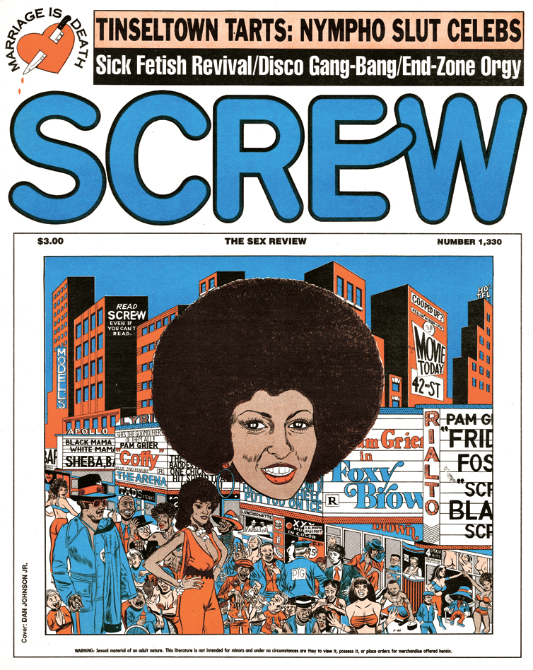
---“Dirty” Danny Hellman has started a new art blog that you’ll definitely want to bookmark, albeit in the comfort of your own home, since it’s devoted to art that graced the cover of Al Goldstein’s prono mag, Screw. A number of noteworthy cartoonists did covers for the magazine at one time or another, including Peter Bagge, Vaughn Bode, Robert Crumb and Wally Wood.--- click on image to read more...
Read More:http://screwmagazinecoverart.blogspot.com/?zx=3bacaa27c3e6d8a8
Read More:http://www.codex99.com/design/75.html


 COMMENTS