Aspen magazine. thinking outside the box.as without from within…
by Art Chantry (art@artchantry.com):
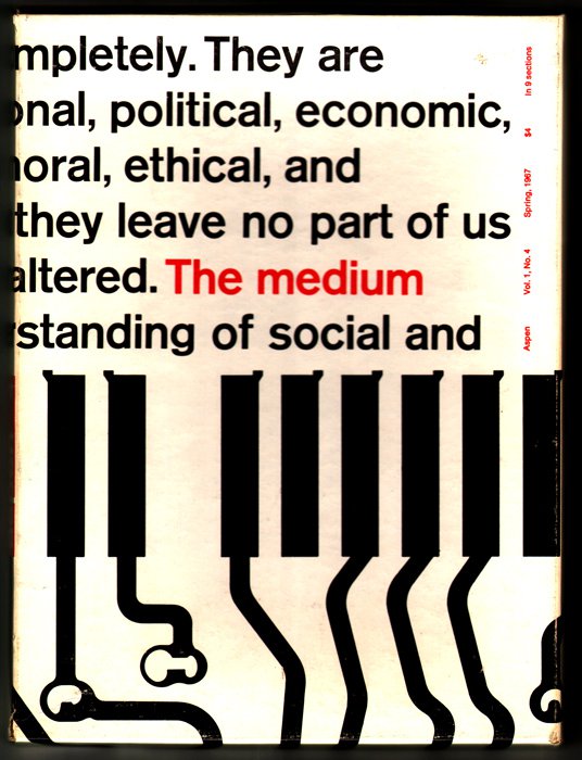
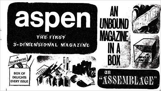
This is ASPEN Magazine (issue #4, spring 1967) – the magazine IN A BOX!!!! this is the final issue (so far as i know.) each issue was in a 9″ x 12″ cardboard box 1/2″ deep. the ‘articles’ were stashed inside as loose items. ‘articles’ was a loose term. they could be a folder, brochures, flexi-disks, stickers, newspapers, posters, flyers, pressbooks, bound booklets, folders, flip books,comic books – whatever came to mind. the ads that were sold in the magazine were simply brochures and ads printed on loose sheets of paper casually tossed inside. It’s like a box of scrap junk.
This magazine was part of a period of intense experimentation in magazine design that happened during the 1960’s cultural upheaval. I have samples of magazine that were printed as newspaper, paperback books, hardback books, LP-format, and just about everything you can imagine. there seemed to be an attempt to re-envision the definition of what a magazine could be.

AC:oh, and this is definitely quentin fiore. his name is plastered all over the stuff. he's credited in the masthead and referred to throughout. they are using his design work on this issue as a major sales tool.
ASPEN, like most of these strange format magazines, was only available through subscription (it could never be sold on a news stand. everything would fall out.) they sold these subscriptions through adverts purchased in “higher brow’ magazines like “Psychology Today” and “Evergreen”. basically, their competition. but the comaraderie of theses adventurous leftist liberal publishers allowed them to help promote each other’s efforts. i remember looking at ads for ASPEN when i was young and being totally confused by it. I couldn’t figure out what was being sold.
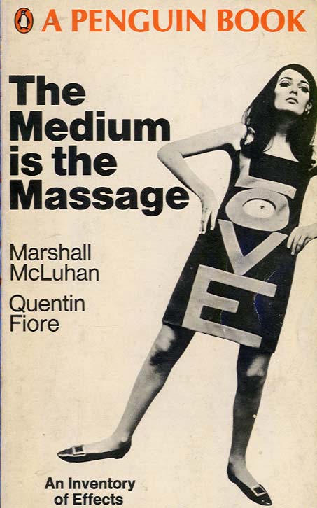
But, the single coolest thing about this magazine was their attempts to promote creative design inside their “pages”. every issue was designed and art directed by a different famous designer. issue number three was by Andy Warhol . this issue #4 was designed by Quentin Fiore – that famous designer most closely associated with his design of the cultural masterpiece tome “the medium is the message” by Marshall Mcluhan. In fact this issue of ASPEN actually has articles and excerpts from the “newly released book” published here for the first time.
Quentin Fiore was forever locked into the mold created by “the medium is the message”. he never really seemed to outlive or outgrow the piece. that’s one of the problems with designing a really famous cultural piece of graphic design – you get trapped. like Peter Max or even today’s Shepard Fairey, Fiore is stuck as ‘the guy who did that Mcluhan book.”

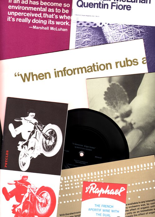
AC:this is a spread of some of the"articles" inside the ASPEN #4 box. there is a flexi-disc of "modern electronic music". picture book, brochures that fold out into posters and much more. down at the bottom is a red, white & blue design for "raphael" wine. that is an example of an advertisement. it's simply tossed in as a loose piece of paper. there are also brochures for european automobiles (tres chic in the mid 60's) and things like the "aspen music festival" (all folkie!).
That’s not to say it isn’t a revolutionary design and a beautiful thing to look at over and over. It’s a classic. things become classics for a reason – they are great work. but, it seems sad to think of so fine a designer spending the rest of his career trying to distance himself from his best work. think of Frank Stella. or Jasper Johns. where do you from the top?
It doesn’t help that Quentin Fiore’s greatest work is also a high point in the history of modernist design – the ‘helvetica’ swiss grid ‘international moderne’ style now locked into the early 1960’s world of the past (think ‘madmen’). shortly after Fiore did this magazine (and the book) his entire style was tossed out the window by a new underground culture for a youthful exhuberant look that began with the hippie counte
ture and and slowly morphed into the pop styles defining today. he was left in the dust.In 1970 (three years after this last issue of ASPEN), Quentin Fiore tried his hand at “being hip” and designed Jerry Rubin’s monumental tribute to his own excess, “DO IT!”. It’s a great design, I guess. but, he was obviously hired because he also designed the Mcluhan book. Rubin and his publishers must have lamely thought having Quentin Fiore design the book would aoutomatically place it in the same category as “the medium is the message”. It didn’t.
“DO IT!” is still based on the same thinking of his classic swiss styling – a massive set of reules and restrictions. then he simply upsets his own apple cart – he breaks all those rules whenever he is so inclined. the results should be an inspiring case of juxtaposition of opposites – a clash of cultures – which always creates a nice clashing buzz conceptually. but, he is so hindered by his own stylistic devotion to the past that he stumbles in his ‘rule breaking’ and end up with ‘rules tweaking’. It fails to inspire and just looks unhip and uncool. too bad.
Not so this ASPEN magazine, though. because it’s such a radical magazine concept, Fiore even outdoes his own “medium is the message” masterpiece in my opinion. I consider this possibly his very finest work. good luck trying to find it intact, however. these things are so rare that they’ve become exotic. and finding them with ALL the stuff still inside? well, I got lucky.
ADDENDUM:
The late sixties cult magazine-in-a-box ASPEN (1966-1971) collected recordings, artwork, stamps, postcards, posters, poems and sometimes even films within each issue, edited by a guest artist. One of the first multi-media, ultra-designed magazines, ASPEN was a physical construction that reflected Mcluhans’ information age (including some of his own writings in issue #3) cloaked in the language of psychedelia and pop-art. Just as Fluer Cowles’ creation FLAIR represented the extreme heights of art possible in magazines of the 1950s, ASPEN took the lead in the 60s, becoming the most extreme example of visual design and multi-media….
…Guest editors at ASPEN #9, included Angus Maclise and Hetty Maclise, central figures of the New York loft scene who created a truly mind-blowing Dream Weapon issue with psychedelic nude postage stamps by Don Snyder, calligraphy by Marian Zazeela, scores by Terry Riley and LaMonte Young, musical “spontaneous sound” flexi-discs by Maclise and friends, Universal Mutant Theater color postcards by Ira Cohen and Bill Devore, and poetry by Vali, John Cale, Gerard Malanga and Lionel Ziprin. The Andy Warhol issue (ASPEN Vol. 1 #3) included pop music trends recorded by the Velvet Underground and a Peter Walker “love raga”, a Music, Man, That’s here It’s At! section in a separate folder contained an essay by Lou Reed, pop-postcards with artists’ comments on their paintings, a news portfolio composite on the Exploding Plastic Inevitable made up of underground newspapers flourishing across the country, an underground flip-book of Jack Smith’s forthcoming movie Buzzards Over Baghdad, and the Berkeley Conference on LSD with texts by Richard Alpert and Timothy Leary. The entire explosion of material was housed in a Warhol designed neon colored FAB detergent box. ASPEN captured the attitude and vision of the 60s within a box. Read More:http://www.thedetroiter.com/nov04/mimeograph.html


 COMMENTS